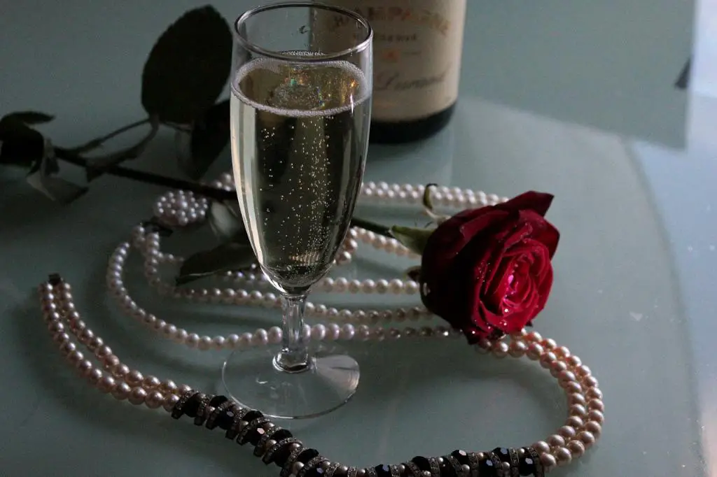
When it comes to selecting a color combination, champagne offers a timeless and versatile palette that can effortlessly elevate any space or design. The subtle yet alluring hue of champagne holds a unique charm and can be beautifully paired with a range of colors, creating a distinct ambiance that exudes elegance and sophistication.
Neutral Companions: Cream, Off-White, Beige, and Black
Champagne harmonizes effortlessly with neutral tones, making it an ideal choice for creating a soothing and calming environment. To enhance the inherent warmth of champagne, consider complementing it with colors like cream, off-white, beige, and even black. This combination adds depth and richness to your palette while maintaining a sense of understated elegance.
Natural and Earthy Harmony
If you’re looking to infuse your space with a touch of nature, earthy tones make an excellent pairing with champagne. Subtle shades of green, reminiscent of lush foliage, or warm earthy browns can create a harmonious blend with the champagne color scheme. These colors evoke a sense of serenity and balance, perfect for bringing a touch of the outdoors inside.
Captivating Blues and Greens
For a refreshing and contemporary aesthetic, consider combining champagne with shades of blue or green. Cool blues can create a sense of tranquility and serenity, while vibrant teals and deep emerald greens can lend a touch of drama and sophistication. This pairing strikes a perfect balance by infusing a pop of color without overpowering the delicate charm of champagne.
Pastel Palette: Soft and Gentle
Incorporating pastel colors into a champagne color scheme can create a whimsical and dreamy atmosphere. Soft pinks, lavender, and baby blues can add a touch of playfulness and femininity to your design. This combination is particularly well-suited for nurseries, bedrooms, or any space that aims to exude a sense of tranquility and gentle charm.
Contrasting Bold and Bright Colors
If you’re seeking to make a bold statement, contrasting champagne with vibrant and vivid colors can create a visually striking effect. Shades of deep red, royal purple, or even energetic yellows can add a sense of drama and personality to your space. This combination is especially ideal for accent pieces or small areas where you want to draw attention and create a focal point.
A Champagne Color Aesthetic: Timeless Elegance
Embracing a champagne color palette allows you to create a design that stands the test of time. The soft and sophisticated nature of champagne makes it a versatile backdrop for a range of styles, from classic and traditional to modern and contemporary. Its timeless appeal ensures that your space will remain effortlessly elegant for years to come.

Conclusion
Whether you’re creating a harmonious and calm ambiance or aiming for a bold and vibrant statement, the color combination of champagne offers endless possibilities. By combining champagne with neutral tones like cream or black, earthy color palettes, captivating blues and greens, pastel shades, or even contrasting bold colors, you can create a truly personalized and unique space that reflects your style and personality. Embrace the timeless elegance of champagne and let your creativity flourish.
