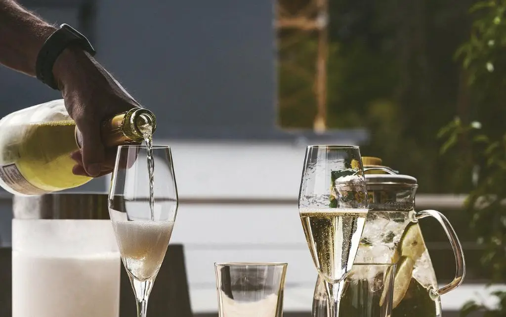
When it comes to creating a color scheme that complements champagne, there are various options available that can enhance its elegance and sophistication. Champagne is a beautiful neutral color that can be combined with a wide range of other shades to create a harmonious and visually appealing palette. In this article, we will explore different color combinations that work well with champagne, allowing you to achieve a stunning and cohesive look in your design projects.
Neutral Tones: Cream, Off-White, Beige, and Black
One of the easiest and most versatile ways to match champagne is by incorporating other neutral tones into your color scheme. Colors like cream, off-white, beige, and black complement champagne beautifully, creating a timeless and classy aesthetic. These neutral shades provide a subtle contrast to champagne, allowing it to stand out while maintaining a cohesive and elegant look.
Earth Tone Colors: Embracing Nature’s Palette
If you want to create a warm and inviting atmosphere, earth tone colors are an excellent choice to pair with champagne. Earthy colors such as warm browns, rich tans, deep greens, and burnt oranges harmonize perfectly with champagne’s subtlety. These colors draw inspiration from nature and can evoke feelings of comfort and tranquility in any space.
Blues and Greens: A Refreshing Combination
To infuse a touch of freshness and serenity into your design, consider pairing champagne with blues and greens. Shades of blue, such as powder blue, navy, or even teal, provide a cool contrast to champagne and create a calming effect. Green hues, whether in the form of mint, sage, or emerald, add a natural element and can evoke a sense of harmony and balance in your color scheme.
Pastel Colors: Softness and Delicacy
For a softer and more delicate aesthetic, incorporating pastel colors into your champagne color scheme can be a fantastic choice. Pastel shades like blush pink, lavender, baby blue, and mint green complement the lightness of champagne and create a gentle and airy ambiance. These soft hues work particularly well in weddings, nurseries, or any setting where a touch of femininity is desired.
Monochromatic Schemes: Shades of Champagne
For a truly elegant and cohesive look, consider creating a monochromatic color scheme using different shades of champagne. By utilizing various tones and depths of champagne, you can achieve a sophisticated and layered effect in your design. Mixing lighter and darker champagne shades, along with texture variations such as metallic or matte finishes, adds visual interest and depth to your overall color palette.
Contrast and Pop: Champagne with Bold Colors
If you’re feeling bold and want to make a statement, don’t be afraid to pair champagne with vibrant and bold colors. Shades of red, deep purple, or even a vibrant yellow can create a striking contrast against champagne, infusing energy and excitement into your design. This combination works exceptionally well for accent pieces or focal points in a room, creating a sense of drama and visual interest.
Metallic Accents: Adding Shine and Glamour
For a touch of glamour and sophistication, consider incorporating metallic accents into your champagne color scheme. Metallic hues like gold, silver, or rose gold blend seamlessly with champagne, providing a luxurious and opulent feel. These metallic elements can be introduced through accessories, light fixtures, furniture accents, or even in the choice of wallpaper or fabrics, adding a radiant and glamorous touch to your overall design.

Conclusion
As we have explored various color combinations that match champagne, it’s clear that this versatile and elegant neutral can be paired with a wide array of shades to achieve different moods and aesthetics. Whether you’re leaning toward a classic and timeless look by combining champagne with other neutrals, or you prefer to experiment with vibrant pops of color or metallic accents, champagne remains a versatile and beautiful hue that can elevate any design project. So go ahead and unleash your creativity to create a stunning and harmonious color scheme that perfectly complements champagne.
