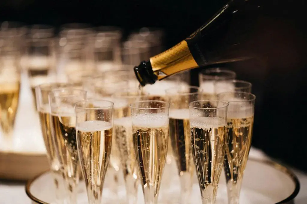
When it comes to finding the perfect color to match champagne, there are a variety of options that can create a harmonious and elegant look. Champagne itself falls into the neutral color category, and as such, it pairs beautifully with a range of colors, allowing for endless possibilities when it comes to creating a cohesive color scheme.
Neutral Colors: Cream, Off-White, Beige, and Black
One color scheme that never fails to complement champagne is the use of other neutral colors. Cream, off-white, beige, and black all work seamlessly with champagne, creating a sophisticated and timeless look. Whether used as accents or as primary colors, these neutrals enhance the delicate charm of champagne, allowing it to shine as the centerpiece.
Earth Tone Colors: Embracing Nature’s Beauty
To bring a touch of warmth and earthiness to your champagne color scheme, consider incorporating earth tone colors. Shades of brown, tan, and terracotta evoke a sense of natural beauty and create a grounding effect when paired with champagne. These colors can be used in furniture, decor, or even accent walls, adding depth and a touch of the outdoors to your living space.
Blues and Greens: A Tranquil and Refreshing Combination
If you’re looking to infuse your champagne color scheme with a sense of tranquility and freshness, consider incorporating blues and greens. Soft shades such as pastel blue or pale mint green contrast beautifully with champagne, creating a serene and relaxing atmosphere. These colors work exceptionally well in bedrooms or living spaces where relaxation and calm are desired.
Pastel Colors: Delicate and Dreamy
For a more whimsical and dreamy aesthetic, pastel colors are an excellent choice to pair with champagne. Light pinks, lavenders, and mint greens can create an ethereal and romantic atmosphere when combined with champagne. Whether used in floral arrangements, textiles, or painted walls, these soft hues add a touch of femininity and charm to any space.
Contrasting Colors: Making a Bold Statement
If you’re feeling daring and want to make a bold statement with your champagne color scheme, consider incorporating contrasting colors. Deep jewel tones like sapphire blue, emerald green, or even a vibrant shade of red can create a striking contrast against the softness of champagne. This combination adds depth and drama to any room, making it the perfect choice for those wanting to make a memorable impact.
Metallic Accents: Adding Glamour and Sparkle
To elevate the elegance of your champagne color scheme, consider incorporating metallic accents. Silver, gold, and rose gold add a touch of glamour and sparkle, creating a luxurious and opulent look. Whether used in accessories, lighting fixtures, or furniture hardware, metallic accents beautifully complement champagne, adding a touch of sophistication.
Finding Your Perfect Combination
Ultimately, finding the ideal color combination to match champagne relies on your personal style, preference, and the overall aesthetic you wish to achieve. Experiment with different colors, textures, and patterns to create a space that reflects your unique taste and personality. Don’t be afraid to mix and match, as the beauty of champagne lies in its ability to effortlessly pair with a diverse range of colors.

Conclusion
In summary, champagne is a versatile and timeless color that can be paired with a myriad of other hues. Whether you opt for neutral shades to enhance its elegance, earth tones to embrace nature, pastels for a dreamy feel, contrasting colors to make a statement, or metallic accents for added glamour, there’s no shortage of options. Let your creativity run wild, and create a space that showcases your personal style with a champagne color scheme that is uniquely yours.
